
A Color Wheel Chart for Clothes: Which Colors Go Together
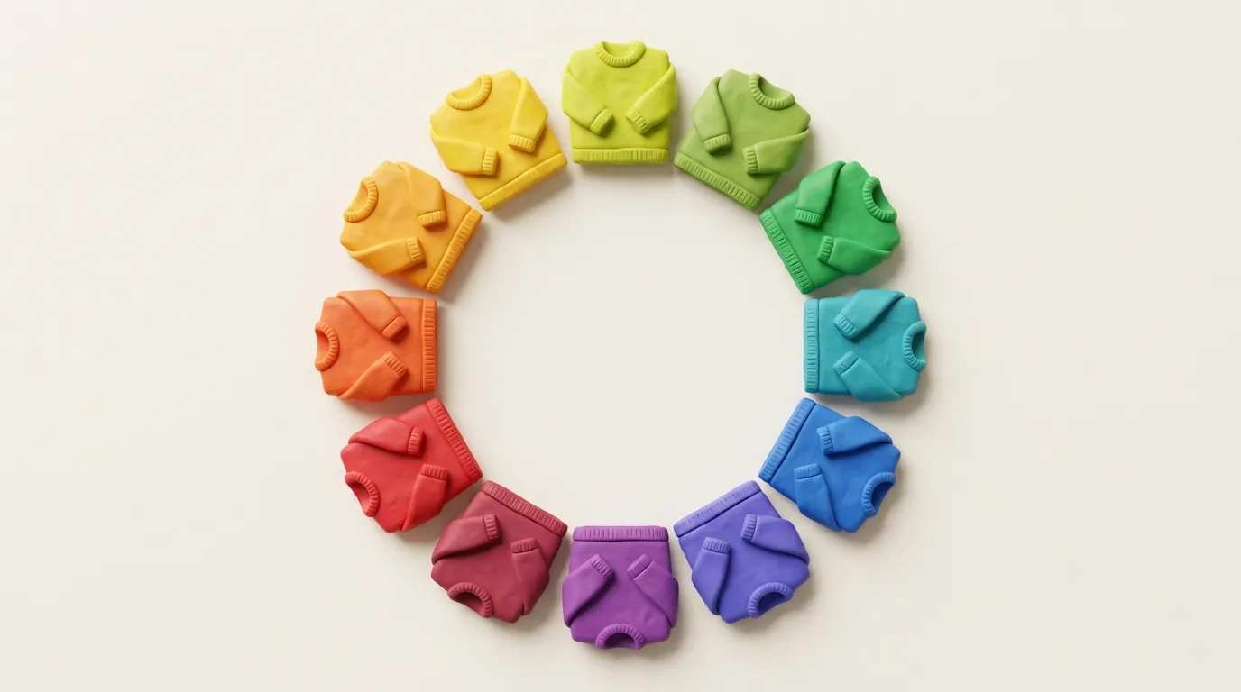
Find your piece's color on a 12-color wheel, then choose from three places: lighter, darker or duller versions of that color, the colors right beside it, or the color straight across from it. New Mexico State University's (NMSU) color guide calls a single color the simplest scheme, and it says opposites are harder to use than neighbors.
That guide and a 1984 University of Idaho guide both print the colors in this order, shown here with each one directly across from its opposite.
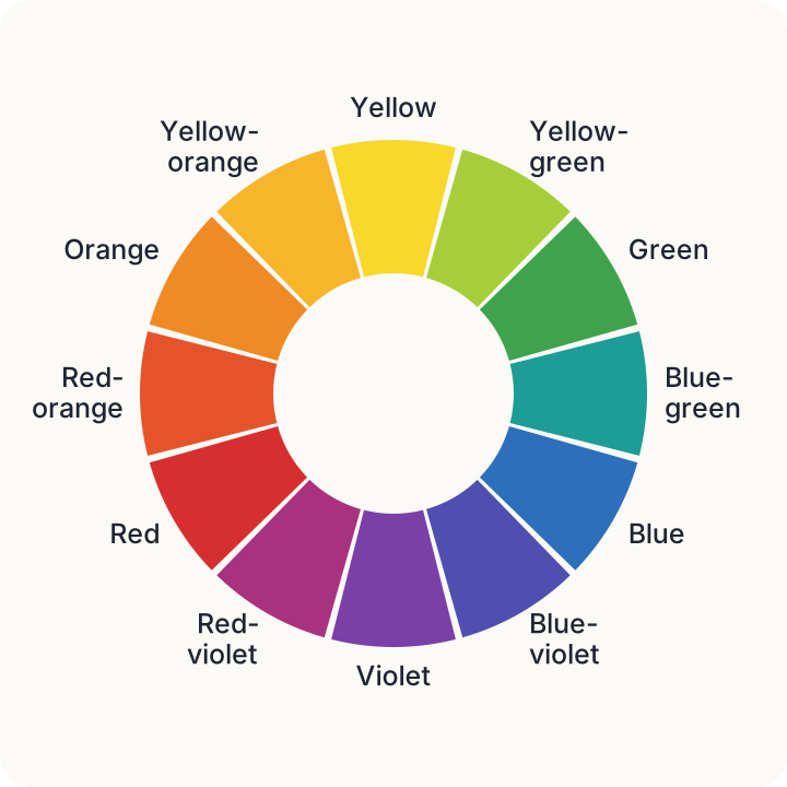
The 12-color chart
Read across a row for a color's two neighbors and its opposite.
| Color | Neighbors | Opposite |
|---|---|---|
| Yellow | Yellow-orange, yellow-green | Violet |
| Yellow-green | Yellow, green | Red-violet |
| Green | Yellow-green, blue-green | Red |
| Blue-green | Green, blue | Red-orange |
| Blue | Blue-green, blue-violet | Orange |
| Blue-violet | Blue, violet | Yellow-orange |
| Violet | Blue-violet, red-violet | Yellow |
| Red-violet | Violet, red | Yellow-green |
| Red | Red-violet, red-orange | Green |
| Red-orange | Red, orange | Blue-green |
| Orange | Red-orange, yellow-orange | Blue |
| Yellow-orange | Orange, yellow | Blue-violet |
It's the paint-style wheel, and a screen's wheel differs: a Bellevue College art handout gives cyan, not green, as red's opposite in light.
Finding your color under a clothing name
Few tags say "red-violet," so you'll often have to translate. These teaching examples from the guides aren't color standards:
- Red: pink, burgundy and maroon
- Orange: brown, beige and a camel coat
- Yellow: goldenrod
- Green: forest green and olive
- Blue: navy, used as a blue but never defined
- Violet: purple, which NMSU's guide uses for the same spots
- Black, white and gray: not on the wheel. NMSU's guide calls them neutrals, and Idaho's says adding one to a color still counts as one color, so start from the other piece's color.
For any other name, such as rust or teal, pick the closest spot by eye.
Schemes to try
We read these schemes as a taught convention, not a rule or a proven fact: NMSU's guide says many other variations are possible and calls it a misconception that some colors should never go together, and neither guide cites a test.
One color (monochromatic)
Use one color at different depths and brightness, and mix textures, because one color alone can get boring. Idaho's own example is a navy shirt, a pastel blue shirt and a navy-and-white patterned vest.
Neighbors (analogous)
Pick colors side by side on the wheel, such as blue-green, blue and blue-violet. The effect is quiet and restful.
Opposites (complementary)
Pick two colors straight across from each other, such as orange and blue. Quiet one side down by choosing a duller, lighter or darker version, or by using only a little of it. NMSU's guide says contrasting schemes need extra attention in clothing, and that reddish colors are the trickiest.
Our own inference, which no source names or tests: navy is a blue in Idaho's guide, a camel coat is an orange in NMSU's, and blue and orange are opposites, so navy with camel can be read as an opposite pair with one side dulled.
Split complementary and triad
A split complementary pairs a primary color (red, yellow or blue) with the two colors on either side of its opposite, and NMSU's example is red with yellow-green and blue-green. A triad uses three colors evenly spaced around the wheel, such as red, blue and yellow, or green, orange and violet. NMSU's guide calls the triad its richest scheme when it's done well.
Start from a piece you already own
Pick one piece you'd like to wear more. A burgundy sweater will do as a made-up example.
- Find its row. Burgundy is a shade of red, so read the red row.
- Choose a scheme. For one color, try a pink or gray piece, since pink is a tint of red and gray is a neutral. For neighbors, try red-violet or red-orange. For opposites, try green, with one side quieted as above.
- Let one color lead. Both guides favor uneven amounts of color over an even split, and NMSU's adds that a touch of bright color can help a subdued mix. Neither gives a fixed ratio, so go by eye.
- Look at the pieces together in daylight around midday. Early morning light pushes colors toward red and yellow, while midday light shows them as they are.
If you like what you see, wear it, and maybe work it into your week's outfit plan. If you don't, go back to step 2 and try another scheme.
Ezfit is a smart digital wardrobe, coming soon to iPhone and Android. When it launches, you'll be able to snap a photo and it will name each piece and tag its color, fabric and style. You'll also be able to pick a piece or two and let it choose the rest. The chart needs none of that, just your clothes laid out side by side.
Sources
- A Guide to Color (Guide C-316), New Mexico State University, College of Agricultural, Consumer and Environmental Sciences, Cooperative Extension Service, Revised March 2018
- Let Color Work for You (Current Information Series No. 733), University of Idaho, College of Agriculture, Cooperative Extension Service, 1984 (print code 3-84; library stamp Sep 20, 1984)
- COLOR WHEELS, Bellevue College (art course materials on its website)
- Ezfit home page: 'Your closet' (#snap) and 'Outfits and looks' (#looks) sections, Ezfit